Monday, December 13, 2010

Final!

Are we finished, really? Can I take this class again?!?

I'm usually relieved to finish a class, but I'm going to miss this one. I think the only thing I didn't like were the Photoshop assignments. I wish I'd had more time, to do more work, to wrap things up the way I wanted to, etc. But I suppose I've learned three major things: I really like watercolors, marker comps are generally helpful, and I shouldn't try to do illustrations completely in Photoshop. Useful lessons, really.

And when I say I'll miss the class, I don't mean the 6 AM alarm clock ; )

Sunday, December 12, 2010

Final Portfolio - Formal Projects

My four best formal projects:

Album cover: I integrated two of my favorite illustration styles: pattern-y watercolor and hatched line art. To me, this has a surreal, pop art, wacky seventies feel, which helps get across the feeling of the album with a little added kick. I think it's an interesting solution to the no-band-members restriction, since my first instinct would have been to draw Carole King and her wild hair.

Cheesy airbrush: I don't have much to say about this that I haven't already posted, but I think it deserves a spot in my top four because it looks like a turtle, but also an illustration of a turtle, which was probably the goal. And he's so nonchalant about it.

Product illustration: I picked this as my best illustration overall, not because it's the most interesting (Listerine just sits there. It can't do backflips.), but because I'm happy with all parts of it. It was challenging to paint something transparent and shiny with tiny text on the label, but I think everything turned out ok. I could see myself incorporating this into a design someday!

3-Image gouache montage: I chose this as one of the top four because it shows my improvement with using the gouache pick out technique. My favorite part of this is the shrimp, and there's some nice contrast going on in the statue and the background. This piece is very different from most other things I've done in this class because it looks the most like a painting, though frankly I'd have done a better job with acrylics. In any case, I'm glad I learned to use gouache!

Final Portfolio - Marker Comp

My best marker comp: the Red Barn pamphlet!

Front: I tried to think about the whole layout, like where the text would go and what I'd do with the background if it looked sort of empty.

Back: I wanted something that would spread throughout the three columns without being too obtrusive to the text. One thing I fixed in the final illustration was the back of the man's shirt: I scooted him off the page a tad more and added some more variation to that block of color.

Final Portfolio - Technique

Ten technique exercises, coming up!

Line Drawing: This was one of the first line drawing exercises I did. Even though it's not as realistic as I usually prefer, I think it shows confidence and bit of style (for example, the shading made of straight lines where curved ones would have been more traditional).

Watercolor: My goal with this illustration was to let the medium do its thing by filling in areas of color and manipulating it to exaggerate the watercolory texture. I think illustration doesn't always have to be particularly expressive; sometimes it's nice to create a pattern or a design with traditional media.

Self Portrait: This wasn't technically an exercise, but I'm counting it as one because I did five or six self portraits before I picked one. I think this shows an interesting interaction between line and color wash since neither component is tightly rendered, but they combine to make a fairly realistic image. I also like the muted color palette.

Line/Wash: This is an example of a watercolor with a little line art thrown in. I used a few different watercolor techniques in this exercise, like wet-on-dry foliage and picked-out pigment on the door. Thinking about it now, I'm not sure if this would be as interesting if the door were any other color.

Watercolor: I painted this so long ago, but I still remember having fun doing it! I seem to recall staying up way too late to add vines to the roof. The building required a bit of planning - I had to think about how to break it down into planes of color, as well as plan the spots that needed to be left blank, like the fancy white ironwork. This is one piece I think looks better without line art, because the cool part about it is the way the structure is subtly suggested with washes.

Watercolor: This reminds me of what my house looked like in the summer! Doesn't it look warm? Anyway, like the previous house, this one uses tinted planes to suggest the architecture, and I think I managed to do the trees fairly well even without a fan brush.

Watercolor: Just like the stained glass illustration, I tried experimenting with the medium in this one. I blended colors within an area, like the street, and even left some dry brush marks. I know the structure and composition leave the whole thing looking a little square, but to me the natural variation of the hand-painted edges give it enough movement and character. It reminds me of the Chelsea district - cool, clean, and artsy.

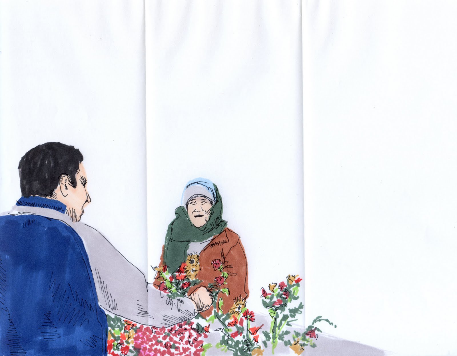
Line: Gabe! I miss him. I don't think I've showed him this drawing; he'd probably hate it. But I think it's a good example of my line art illustration style: straight hatching, contoured hatching (in the hair), outlines, contrast, and a simple background. And a whimsical subject.

Watercolor: When I found this photo on my phone, I knew I had to try to paint it. The shadows are particularly awesome, and I thought it would be a challenge. It was. I'd already played with negative space and watercolor, so I thought I would at least try to vary the color within the chairs. I also wanted the shadows to stand out, so I made them a little darker than they should be, and I left the background blank.

Painted Line: This didn't take me too long, and it proved to me that I should try doing things quickly more often! But of course some parts turned out better than others: Gabe looks like Gabe, but Sam doesn't look so much like himself, and the glasses are kind of interesting, but the right side of the table is muddy. I guess you get what you get.

Friday, December 10, 2010

Last Projects

It seems like I haven't posted in so long...but I've been working on these last three projects: the album cover, book jacket, and cheesy airbrush.

I'm not proud to say I'm the happiest with the third.

Anyway, here they are:


Cheesy airbrush: I didn't want to do a cartoon. I started off looking for pictures of dolphins, thinking I could maybe illustrate a porpoise with flames behind its tail or something, but then I stumbled across some pictures of sea turtles. I figured the subject matter was cheesy enough, even sans flames, so I went with it. I actually had fun with the airbrush this time around! I'm pleased with how the light yellow bits turned out, but I think I could have done better on the turtle's shell and the definition of the fish in the background. Perhaps the most redeeming thing about this project was that I didn't have to incorporate it into a design.


Book jacket: How do you illustrate The Great Gatsby? I had all sorts of ideas that combined the characters and the green light and the eyes of Dr. T.J. Eckleburg, but unfortunately that turned out to be a whole lot to fit into one illustration. I settled on a simple line drawing against a separate color wash (meant to evoke the colors of Long Island at sunset), but I definitely think I could have done much better with the layout. I mean, ew, it's too boring. I should have blown up the illustration and bled it onto the sides...here's the front cover:

Anyway. You see what I mean.


Album cover: Originally I was going to do an album by The Mountain Goats, but then Carole King popped up in my iTunes shuffle and I thought I could do something cool and graphic-y with Tapestry. It helped that the original cover art is terrible, too - it's just a picture of Carole King in a windowsill holding a piece of cloth. Well, there's a cat in the foreground too. Anyway, I painted a seventies tapestry-like pattern, then struggled with what to do with it for two weeks until I finally decided to draw a hand holding the tapestry. And this is what I came up with. It might look a little bit like the opening credits of Monty Python, but it's better than looking like your grandma's couch, that's what I always say.

Monday, November 15, 2010

Airbrush Planet

I did Jupiter. It went a little better than I expected! I could still use some practice, though...

Illustratin' Extra Stuff

I made an Italian newspaper - Il Giornale, creative, I know - for my Viscom II class, and the big headline was a story about a stolen Degas painting that was found in New York. I illustrated it with some watercolors.


Marker Comps...

Oh goodness. I am kind of behind on my marker comps. I can never decide what to do! I'm not particularly inspired by any of the book titles on the list...except perhaps for To Kill a Mockingbird, but that's really only because it conjures the image of Gregory Peck's glasses and my father's imitation of him. Plus the original book cover was just so cool, so how do I top it? I like 1920s style, so I picked The Great Gatsby, but now I'm not really doing the story justice. I'd much rather do Extremely Loud and Incredibly Close or The Catcher in the Rye or A Moveable Feast....or any other Hemingway, for that matter, because there's always the option of drawing six-toed cats.

Anyway. I suppose I'll make it work.

Airbrush Fruit

It's a mango. I should have sprayed a little red on the flesh...and maybe added some more splotchy detail on the skin.

Monday, November 8, 2010

3-Image Gouache Montage

Three random images: a shrimp, a Mary statue, and some cotton candy. I'm rather frustrated with the gouache pick out technique because I have a hard time adding colors without making it into an opaque, layered acrylic painting. That's sort of what I ended up with here. I'm happy with the shrimp, but I wish I'd done something else besides cotton candy - not because of the texture, but because the pink/purple color looks so bad against the shrimp! Plus both of them together kind of make me nauseous (though not so much as my dad would be, I guess, since he's deathly allergic to shrimp. And my mom really likes cotton candy, if we're doing a Freudian analysis). Anyway, here it is:


Thursday, November 4, 2010

Gallery 1/33


This kind of came up fast, but Tuesday was the opening of my exhibit in Gallery 1/33. Rosemary and Allison asked me at the beginning of the semester if I'd do a show, and I agreed, not knowing what I would put in it - so I did watercolors! I shrunk them down, printed them out, and mounted them on black paper to hang in the locker. To be honest, though, my favorite part about the gallery opening was baking lots of biscotti.

Friday, October 29, 2010

Product Illustration

It took me quite a while to come up with something to illustrate for this project. I wanted to do something familiar and iconic, but Coke bottles have been done before! I decided Listerine was a good choice because it's blue and shiny and recognizable.

I was kind of scared to do a gouache pick out illustration because I'd never successfully done one before - my gouache was too cheap - so I started two Listerine illustrations: one on illustration board with the gouache, and one on watercolor paper, still with gouache, but used like watercolors. I worked on both until the watercolor one won out. Here it is.


Monday, October 18, 2010

Midterm Portfolio

Choosing my best and worst pieces was harder than I thought it would be! I had too many bad ones to choose from and not enough that I'm satisfied with, so I thought about my goals for this class and picked these two. We've been focusing a lot on watercolors, which I really like (as opposed to, say, the pen tablet), and I think I've been getting a little better! Take a look:

My worst piece: a 5x7" watercolor of the Disney Concert Hall in LA. Not only did I lose control of the watercolors, I might have insulted Frank Gehry. This stands out to me as one of my worst watercolors because it has no definition of form, the colors are bland and straight from the palette (and I used black - I never use black!), the water seems to have escaped any boundaries I might have thought of, and there isn't a lot of contrast. The only (slightly) redeeming thing is the lower right hand corner where I managed to define part of the form with white and shadow washes - but the shadows are too dark, not varied, and nowhere near the correct shape. And where I might have been able to rescue another bad watercolor with some line art, here this one fails too: the colors are just too boring.

I picked this as my best work not because I think it's perfect, but because I think it represents my improvement. A more traditional, painterly watercolor might have been a more obvious choice for my midterm, but this piece proves that I've been branching out. The subject is a street in the Chelsea Art District in NYC; I illustrated it because I was intrigued by the proportions of some of the windows and grate things on the building. I used muted colors on cream paper, and maybe my color choice combined with the horizontal composition makes everything seem too quiet, but I like it that way. I love to play with watercolor's ability to fill in a space with really subtle color and saturation variations, and sometimes I feel like the medium should be shown off. One of my favorite bits is the bottom edge where the brush started to go dry - I physically had to pull my own hand back to stop myself from "correcting" it. I consider this an achievement. I also think the colors that make up the street are blended well (or at least interestingly). I'm not entirely happy with the trees (they look kind of noodly), and I wish I'd thought to make the top edge straighter, but I like the proportions and interaction between the negative (paper) and positive (painted) space. For me, this captures a feeling - of being in Chelsea and being inspired by contemporary art - and that's what illustration is all about!

Red Barn

This is kind of unsatisfying...I'm finished with the assignment, but the brochure is so empty! If I had had time, I would have at least put a title on the front panel. My illustrations are looser than normal, I think, but I'm pretty satisfied with them. Maybe I should have done them a little bigger so they'd shrink down and look more realistic...or maybe not. I can't decide.


Wednesday, October 13, 2010

Mural

This is the marker comp for the Ryle Hall Cafeteria mural. My original idea was to have lots of silhouettes interacting on top of a purple splattery background, but I decided that was cheesy and I wouldn't want to look at it if I were eating in the cafeteria. Instead, I went with an interior design kind of approach and used a map of campus and some trees to add a texture/pattern to the wall. It's in yellow to match the decor in the cafeteria, but the colors could be changed.

Monday, October 11, 2010

Red Barn Marker Comp

I finally got things planned out for my Red Barn pamphlet! There are a few things I'm going to change, of course...

Someone suggested incorporating some red in the bottom.

And I'm going to scoot that guy over so we see less of his back.

Friday, October 8, 2010

Negative Space

Two more 8x10 watercolors, both from cell phone pictures I took on Cherokee Street.


Wednesday, October 6, 2010

Ugh.

I'm kind of ashamed to post this one, but I will anyway. I was trying to be loose and expressive, but I think I should have done about ten of them and then picked the best. This one was like the first pancake of the batch....all rubbery and underdone. Or burnt, it depends. In any case, Monica is a rugby tackling beast.


Monday, October 4, 2010

8x10 Watercolors

I painted these at midnight last night, and I decided I wasn't going to spend a lot of time on them. So I didn't, but I kind of like how they turned out!

Chelsea art galleries

My brothers, Sam and Gabe.

Wednesday, September 29, 2010

Poster Illustration


What was I thinking?

I don't know.


I started off by doing a watercolor too tightly, then I tried to loosen it up with some scribbly line work, and finally topped it off with a boring layout. And I need to throw some green and pink in there somewhere, I suppose. But props to my friend Kellie for taking the reference picture especially for me!


Monday, September 20, 2010

Self Portraits

I know I didn't have to do more than one of these, but I didn't like any of them, so I just kept going. Some of them were kind of cool but were rejected because they don't look like me.

The one I used. I was really excited to do some tape resists.

This one's ok.

I like the colors, but who IS that?


Octopus shirt.

Friday, September 17, 2010

Watercolor/Line

I wish I had done more of these, because I feel like I was really close to getting one that I liked. Unfortunately, I didn't make it all the way there, so these are all sort of halfway okay. They're all pictures of a hipster in fantastic red boots smashing a pinata at the St. Louis Contemporary Art Museum. It was one of the most whimsical art exhibits I've been to - the pinata was shaped like a Klein bottle, which is supposed to represent four dimensions, and it was filled with candy and bouncy balls and tangerines. There was a mariachi band and plastic maracas and tacos too!

This is my favorite, I think, because I like the blend of colors and the
interaction with the line art. I think the line art could be lots better, but I
think I am happy with it because I used some paper left over
from printmaking class instead of the Canson watercolor paper I hate.

Same paper, awkward brown splotch.

Splatter! But bad line art, not enough color variation, etc.

Mud. I really do like the guy in the background though.

Why did I make that green so bright?!?